Editorial Perspective
The Bloom Journal.
A quieter editorial space for longer thoughts on digital craft, restraint in interaction, and building web experiences that last.
Journal articles examine the ideas behind Bloom's interface choices — offering context for designers, founders, and returning readers.
Essay 01
Design-Led Motion vs. Decorative Noise.
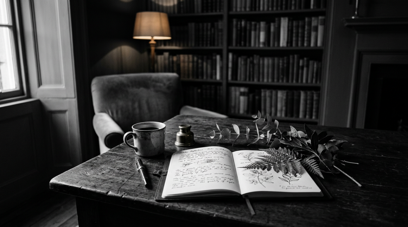
When every element on a web page bounces, spins, or zooms, nothing retains emphasis. Design-led motion establishes clear hierarchy before adding a single frame of movement.
At Bloom, motion is used like punctuation in typography: a comma to pace the reader, a period to end a thought, never an exclamation point on every line.
Essay 02
The Power of Uncluttered Surfaces.
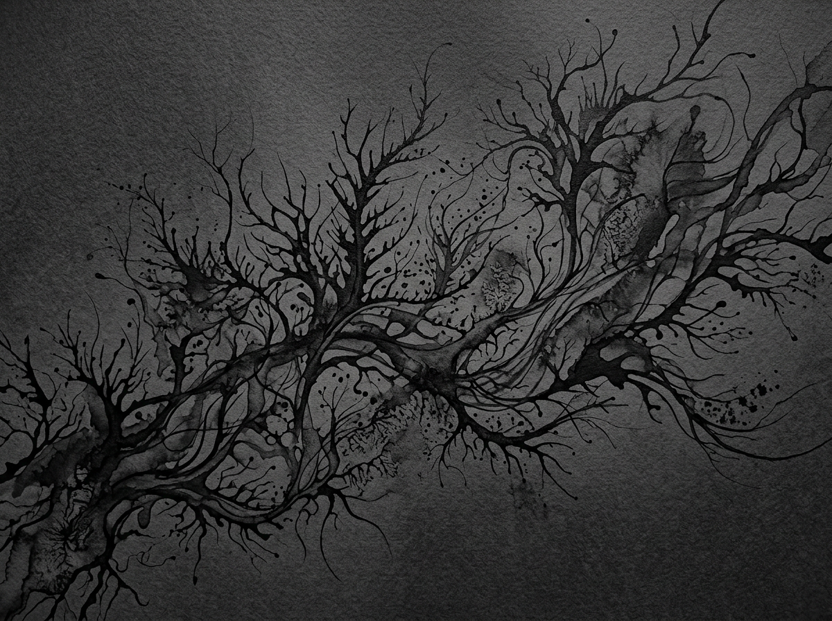
Clarity on the web comes from what you choose to omit. When visual clutter is stripped away, the remaining typography and spatial relationships carry immense weight.
Liquid glassmorphism allows content blocks to float organically over deep grayscale backgrounds without hard borders or conflicting background colors.
Essay 03
Cultivating Botanical Softness in Digital Form.
Bloom combines high-contrast typography with subtle botanical softness: delicate particle fields, organic particle drifts, and quiet glass textures.
This contrast gives the site a warm, human editorial feel that sets it apart from cold, sterile tech templates.
Essay 04
Interactive Cues Worth Noticing.
Subtle microinteractions build trust over repeated visits. Three specific patterns on Bloom demonstrate this quiet craft:
Cursor Tracking
A gentle circular mark following cursor movement without lag.
Marquee Loop
Smooth endless clone loop providing momentum.
Theme Shift
Clean dark/light state application without jarring reloads.
Next Thought
Have thoughts or questions on our editorial approach?
We welcome conversations with designers, builders, and brands who share a passion for controlled digital experiences.
Get In Touch